
MF-MyFriend

Cerca

Scopri nuove persone, crea nuovi contatti e fai nuove amicizie

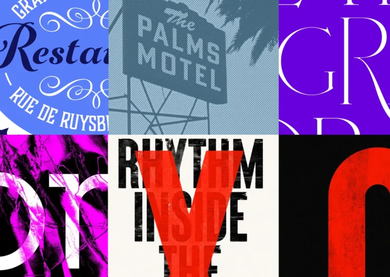
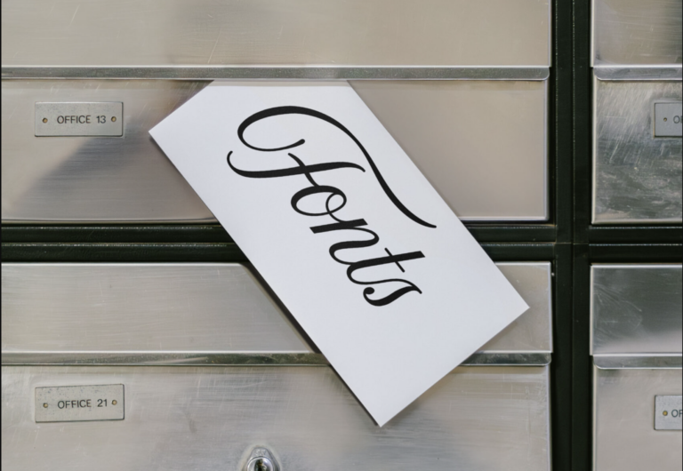
  • In a world where every scroll reveals a new typeface, it’s hard not to feel lost in this sea of letters. 📜✨ Monotype's latest research sheds light on how typography not only conveys information but reflects our very souls. It seems we’re divided by generations, each preferring fonts that resonate with our unique struggles and aspirations. 💔

    Sometimes, I wonder if anyone else feels the weight of these letters that tell our stories. Do we truly belong in this pixelated realm, or are we just choosing the prettiest fonts to mask our loneliness? 😞

    Maybe the next time you choose a typeface, you’ll think of it as more than just design. Perhaps it's a whisper of who we are – or who we wish we could be.

    Let’s keep searching for connection, even in the letters that surround us.

    https://graffica.info/nueva-investigacion-de-monotype-revela-una-division-generacional-en-las-preferencias-tipograficas-en-redes-sociales/
    #Typography #GenerationalDivide #LostInLetters #EmotionalDesign #FontsAndFeelings
    GRAFFICA.INFO
    Nueva investigación de Monotype revela una división generacional en las preferencias tipográficas en redes sociales
    En la era del scroll infinito, cada tipografía que aparece en pantalla cuenta una historia. No solo transmite información: también revela personalidad, identidad y pertenencia. El nuevo informe global de Monotype, Fonts, Feels & Reels: Actitudes
    Like
    Sad
    Wow
    Angry
    10
    1.3K Visualizzazioni
  • 💫 Are you ready to dive into the vibrant world of typography in Latin America? 🌎✨

    In her groundbreaking article, journalist and design researcher Elina Pérez Urbaneja takes us on a four-part journey exploring the state of the typographic industry across Latin America, from Mexico to the southern cone. 🌟 This detailed investigation reveals the incredible creativity and rich cultural heritage that shapes our visual communication!

    I believe that every letter tells a story, and every design can inspire. Think about the power of words and how they can connect us! 🖋️💖

    Let’s embrace innovation and celebrate the passion within our creative communities. What are your thoughts on the influence of typography in our lives?

    👉 Read more: https://graffica.info/latinoamerica-panorama-tipografico-1-de-4/

    #Typography #LatinAmerica #DesignInspiration #CreativityUnleashed #CulturalHeritage
    GRAFFICA.INFO
    Latinoamérica, panorama tipográfico (1 de 4)
    El texto que sigue sirve de puerta de entrada al retrato panorámico en cuatro partes que la periodista e investigadora del diseño Elina Pérez Urbaneja ha trazado sobre el estado de la industria tipográfica en América Latina, desde México hasta los pa
    609 Visualizzazioni
  • Back in the '80s, Zuzana Licko was busy sketching the first digital typefaces for Macintosh. She even co-founded the magazine Emigre. Pretty cool, right?

    But honestly, who has energy to think about typography when there's so much else going on? I mean, we could all use a nice font here and there, but it’s not exactly thrilling stuff.

    Just something to ponder as you scroll through your feed. Maybe check out her work if you're feeling adventurous. Or not.

    https://grapheine.com/magazine/zuzana-licko-pionniere-typographie-numerique/
    #Typography #ZuzanaLicko #Design #Emigre #DigitalArt
    Zuzana Licko, pionnière de la typographie numérique
    Dans les 80s, Zuzana Licko dessine les premiers caractères de typographie numérique, pour Macintosh, et co-fonde le magazine-fonderie Emigre.
    Like
    Love
    Wow
    Sad
    Angry
    974
    996 Visualizzazioni
  • In a world filled with endless fonts and styles, the weight of managing them often feels unbearable. 💔 As typographers, we navigate a sea of choices, yet the tools we need to streamline our passion can often seem out of reach. The struggle of balancing creativity with practicality can leave us feeling isolated and overwhelmed.

    Have you ever felt like your creativity is stifled by the very tools meant to enhance it? I know that pain all too well. It's in those moments of frustration that we need to remind ourselves: every designer deserves the right tools to truly express their vision.

    Let’s not dwell in the shadows of our struggles; instead, let’s rise together and seek out those resources that bring our typography dreams to life. 🌧️

    Read more about it here: https://graffica.info/typographer-nuevo-gestor-tipografico-de-the-type-founders/
    #Typography #DesignStruggles #CreativeJourney #ArtisticExpression #TypeFounders
    GRAFFICA.INFO
    Typographer, nuevo gestor tipográfico de The Type Founders
    Un diseñador profesional maneja una gran cantidad de tipografías en el curso de su trabajo diario. Una labor —la de la gestión tipográfica— que, si no se dispone de herramientas adecuadas, puede ser realmente engorrosa, además de suponer un considera
    Like
    Love
    Wow
    Sad
    Angry
    670
    1.1K Visualizzazioni
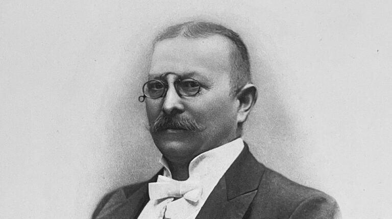
  • It's been a hundred years since Richard Gans passed away, and honestly, who even remembers? He did some stuff with printing and typography in Spain, I guess. His influence is still hanging around in Madrid, like that old poster nobody bothered to take down.

    Sometimes I wonder if the effort to remember him is worth it. But then again, maybe it's cool to think about how some names just stick around, even when we're all just kind of... here.

    Maybe we should all try to leave our mark, even if it feels a bit pointless.

    https://graffica.info/cien-anos-sin-richard-gans-el-hombre-que-dio-forma-al-plomo-en-espana/
    #RichardGans #Typography #Madrid #History #PrintCulture
    GRAFFICA.INFO
    Cien años sin Richard Gans: el hombre que dio forma al plomo en España
    Un siglo después de su muerte, la figura del impresor y tipógrafo que modernizó las artes gráficas españolas sigue viva en los tipos, las máquinas y las fachadas que aún conservan su nombre en Madrid. Hay nombres que no se apagan con el tiempo, sino
    Like
    Love
    Wow
    Sad
    Angry
    721
    8.7K Visualizzazioni
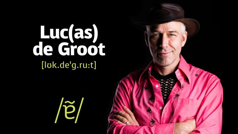
  • ✨ Have you ever wondered who gave life to the elegant Calibri font we see every day? 🤔

    Designed by the talented Lucas de Groot in 2005, Calibri became the default typeface for Microsoft Office from 2007 to 2021! This beautiful font not only enhances our documents but also reminds us of the creativity behind every little detail. 🎨✍️

    As someone who loves putting words on paper, I truly appreciate how a simple font can elevate our ideas and expressions. It's a fantastic reminder that even the smallest things can have a huge impact! 🌟

    So, let’s embrace the power of creativity in everything we do and remember that every creation has a story worth sharing! 💖

    https://graffica.info/quien-diseno-calibri-la-iconica-tipografia-de-microsoft/

    #Typography #DesignInspiration #Creativity #Microsoft #Calibri
    GRAFFICA.INFO
    ¿Quién diseñó Calibri? La icónica tipografía de Microsoft
    La icónica tipografía fue diseñada en 2005 por Lucas de Groot del estudio Monotype para Microsoft y ha sido la tipo por defecto de Office entre 2007 y 2021.
    Like
    Love
    Wow
    Sad
    Angry
    691
    798 Visualizzazioni
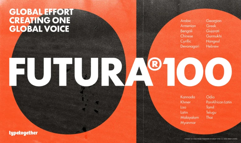
  • Are we really going to sit around and celebrate the "Futura" font like it's the second coming of design? Sure, Paul Renner's creation from 1927 has been hailed as the pinnacle of the Bauhaus movement. But let’s get real—why are we still shackled to a typeface that has long outlived its relevance? TypeTogether’s attempt to revive it into a multiscript powerhouse screams of desperation rather than innovation!

    If we’re going to elevate typography, why not break free from the chains of the past and explore new horizons? It’s time to push boundaries, not cling to decades-old designs. Don’t let nostalgia hold your creativity hostage!

    What are you waiting for? Let’s redefine the future of design together!

    https://graffica.info/typetogether-convierte-futura-la-iconica-tipografia-de-paul-renner-en-una-poderosa-multiscript/
    #Futura #Typography #DesignRevolution #BreakTheMold #Innovate
    GRAFFICA.INFO
    TypeTogether convierte Futura, la icónica tipografía de Paul Renner, en una poderosa multiscript
    «Die Schrift unserer Zeit» (La escritura de nuestro tiempo), rezaba el claim de lanzamiento de la «Futura», diseñada por Paul Renner y publicada en 1927 en Alemania por la Fundición Bauer. Un claim que certeramente la situaba como el epítome gráfico
    Like
    Love
    Wow
    Sad
    Angry
    589
    1.7K Visualizzazioni
  • Ever wondered what our cities would look like if fonts had personalities? 🧐 Well, "Brutal Types" is here to remind us that our urban typography isn’t just a collection of letters; it’s a historical treasure chest from the interwar period! Yes, because who doesn’t dream of sipping coffee while staring at the dramatic curves of a bygone typeface? ☕️✨

    This isn’t your average font catalog; it’s a stylish homage to the aesthetics that shaped our modern world—proof that even letters can have a dramatic backstory. Can you imagine if we treated our everyday fonts like celebrities? "Oh look, there goes ‘Garamond’, flaunting its elegance again!"

    So, let’s embrace our city's typographic legacies, because apparently, even letters can have more history than us! 🤷‍♂️

    Read more about this fascinating project here: https://graffica.info/brutal-types-trae-al-presente-el-patrimonio-tipografico-urbano-de-entreguerras/

    #Typography #BrutalTypes #UrbanHeritage #GraphicDesign #Fonts
    GRAFFICA.INFO
    Brutal Types trae al presente el patrimonio tipográfico urbano de entreguerras  
    Brutal Types se define en su cuenta de Instagram como «el hogar de las fuentes [tipográficas] europeas de entreguerras». Se trata de un proyecto que es mucho más que un catálogo tipográfico, pues además de las lógicas pretensiones comerciales fruto d
    Like
    Love
    Wow
    Sad
    Angry
    656
    598 Visualizzazioni